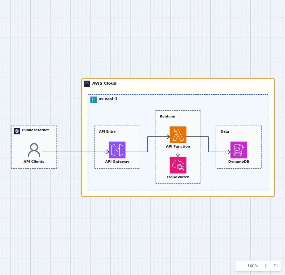
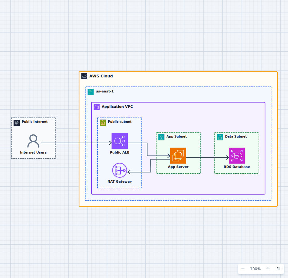
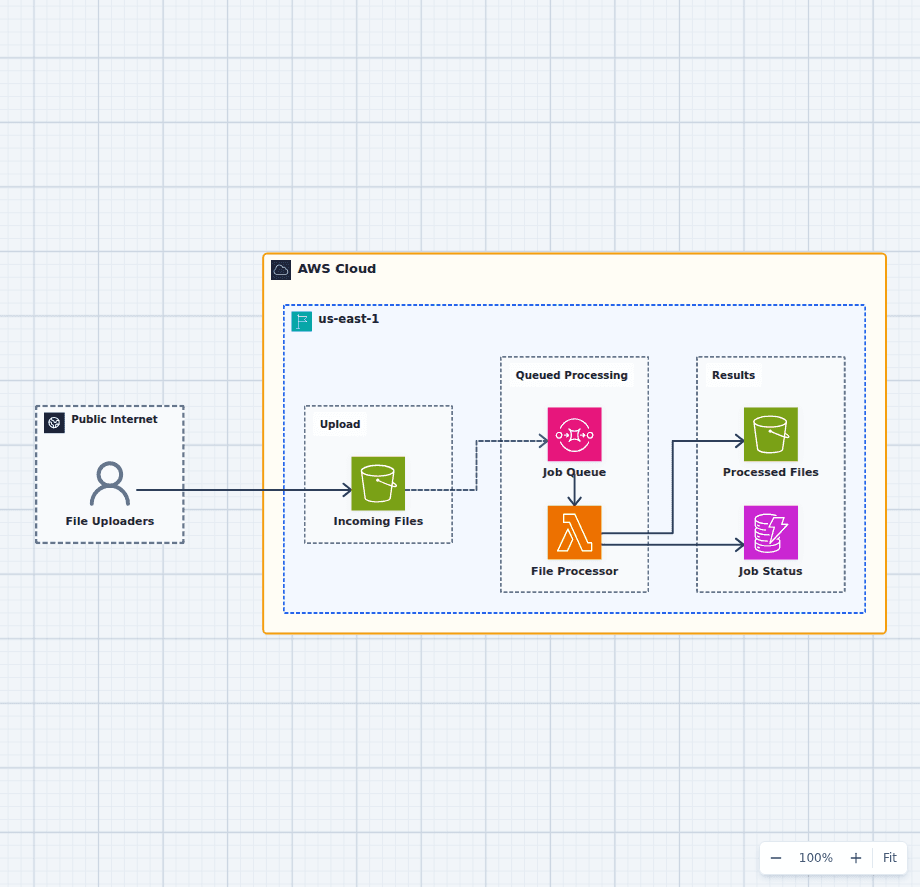
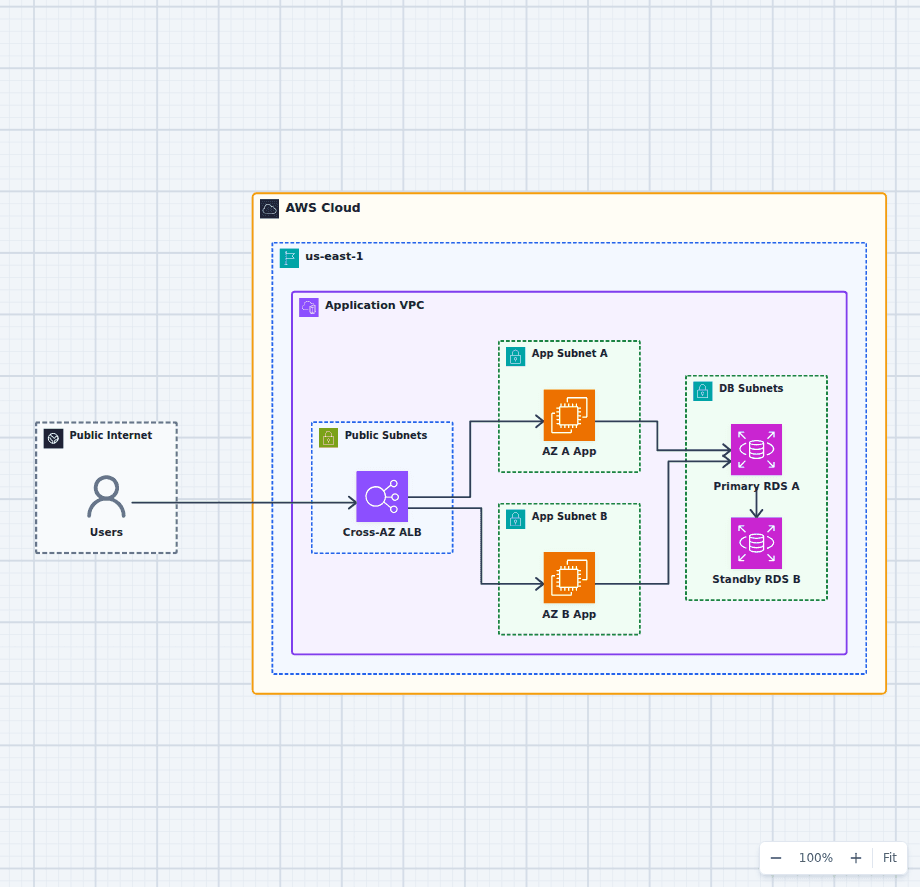
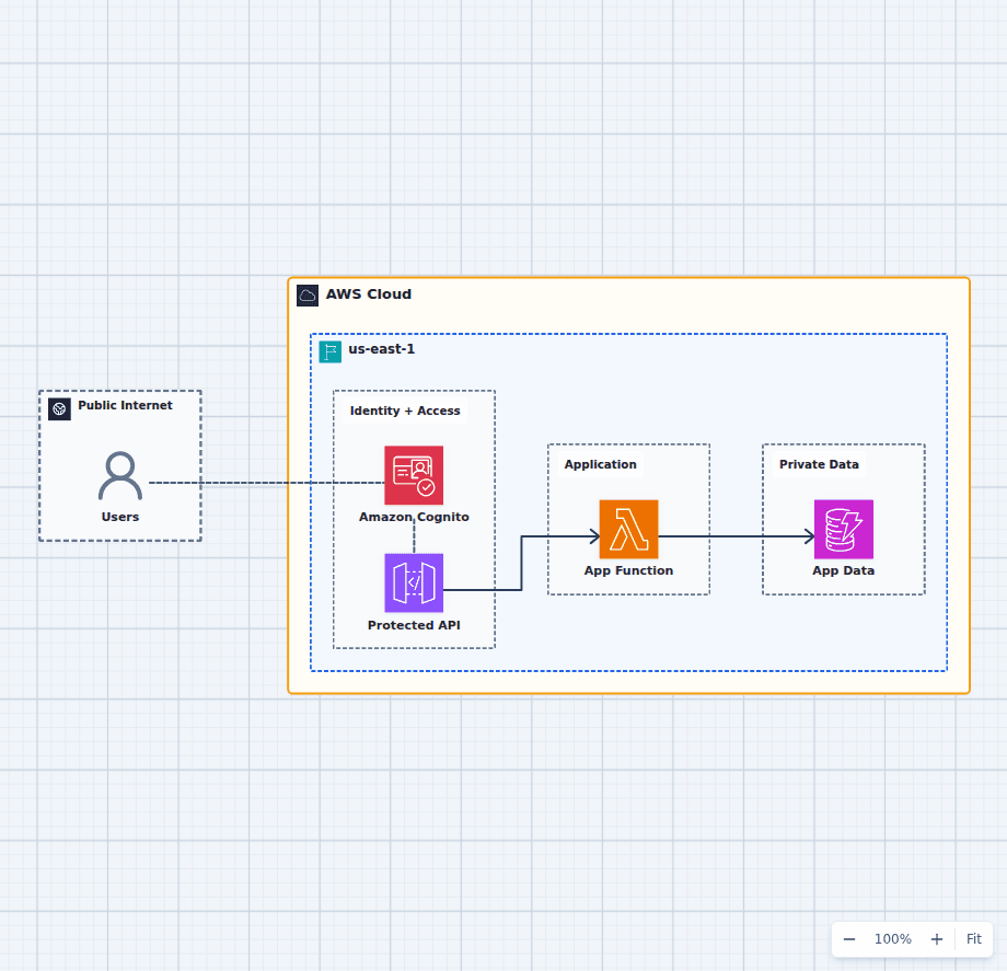
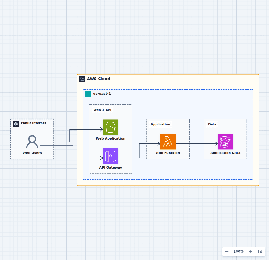
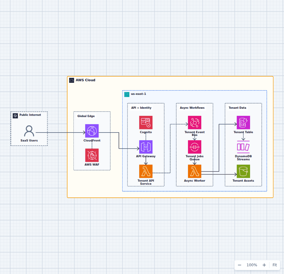
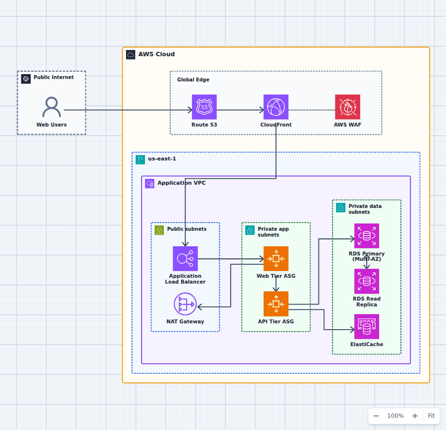
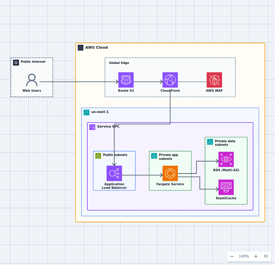
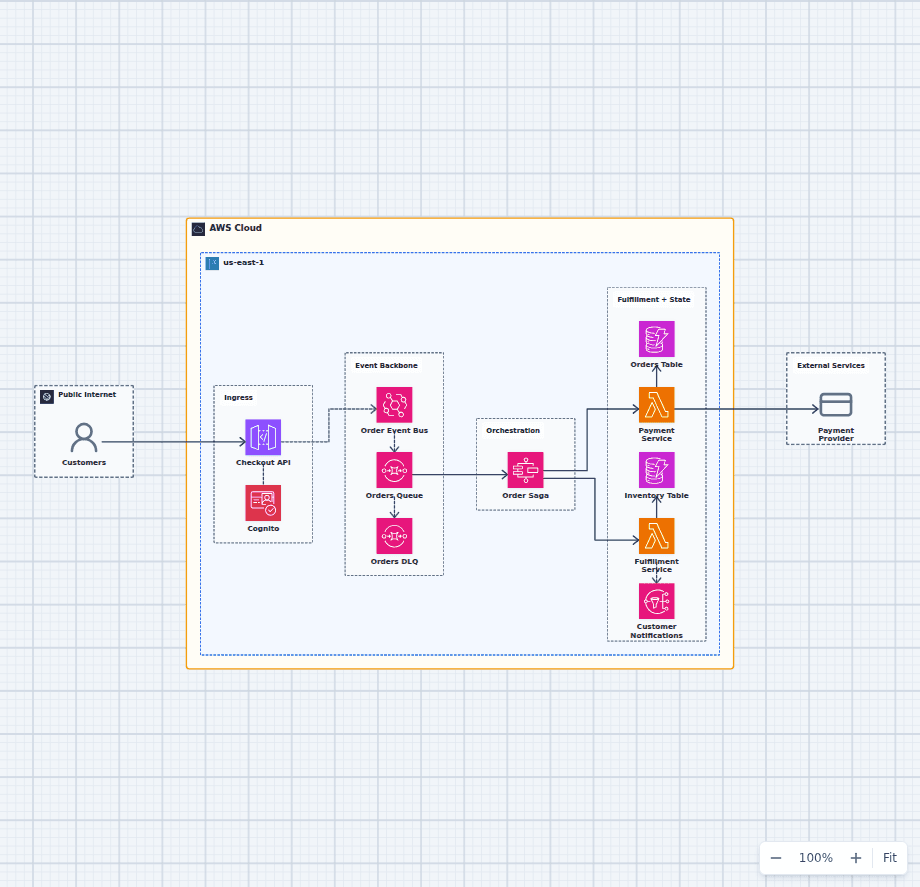
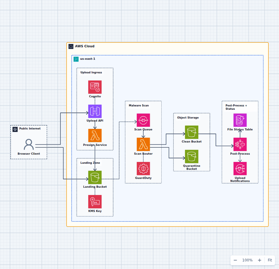
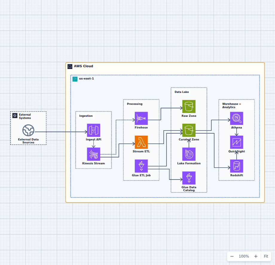
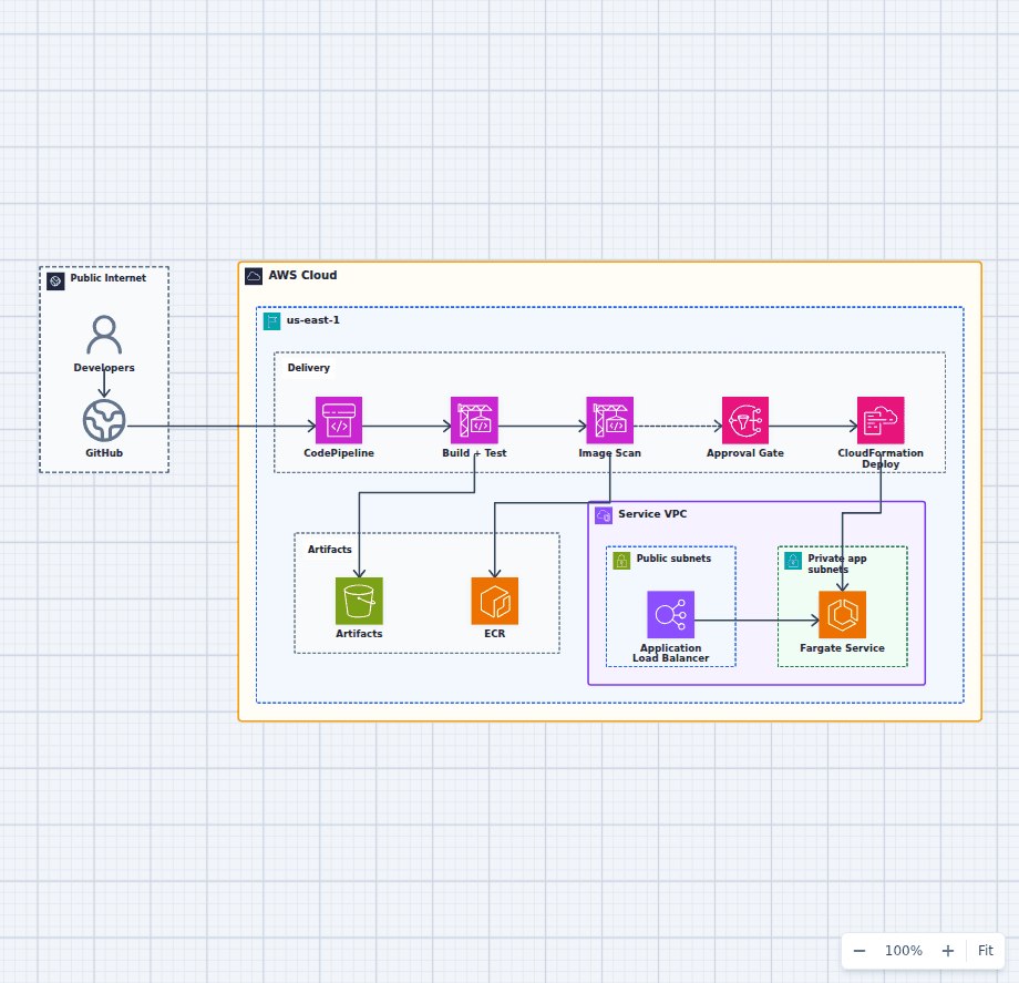
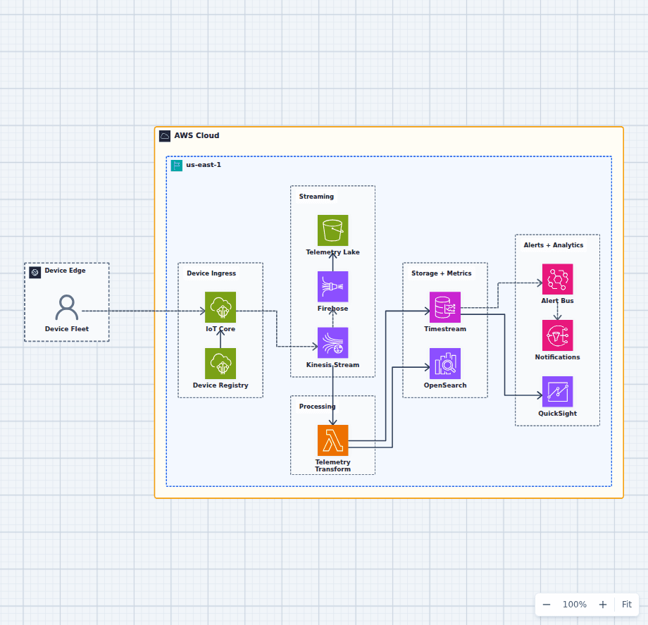
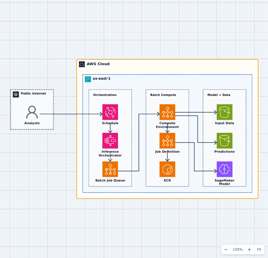
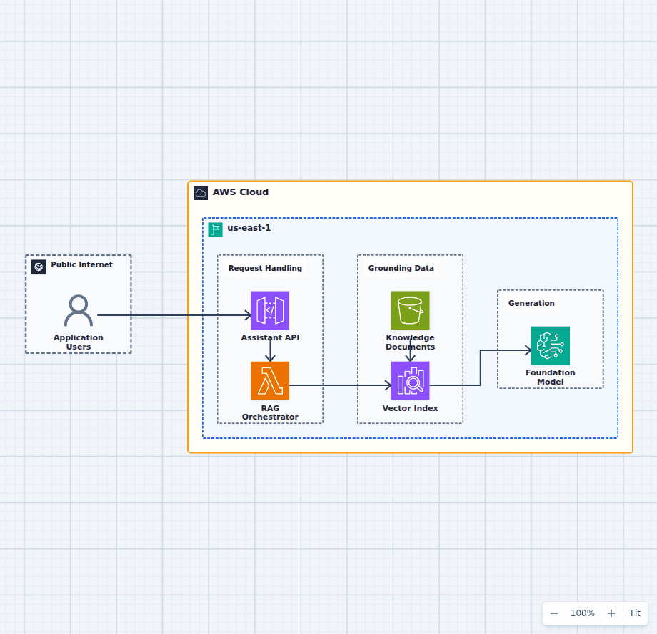
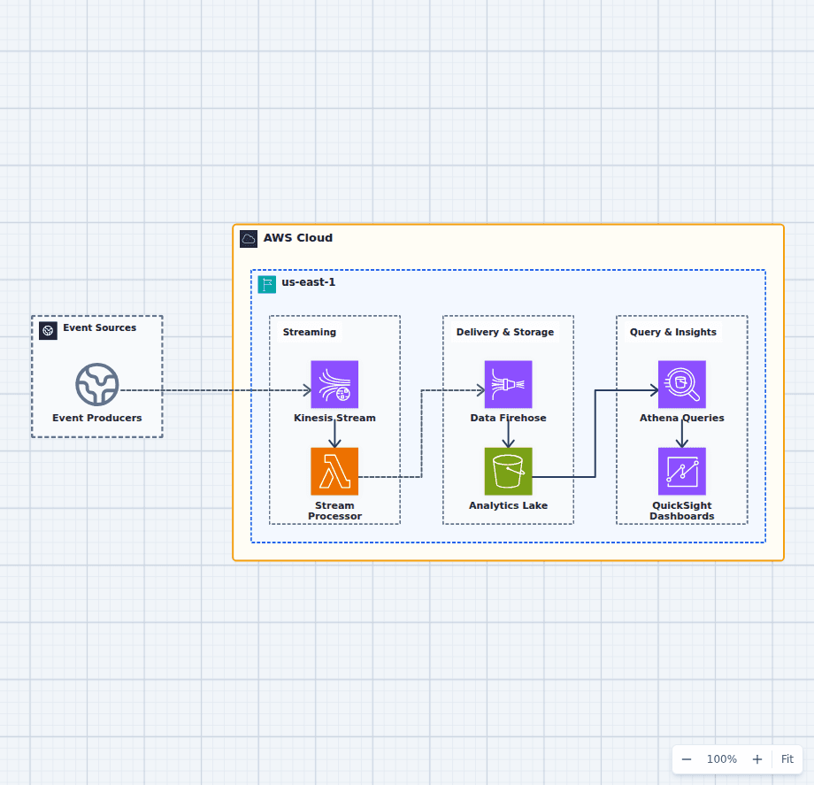
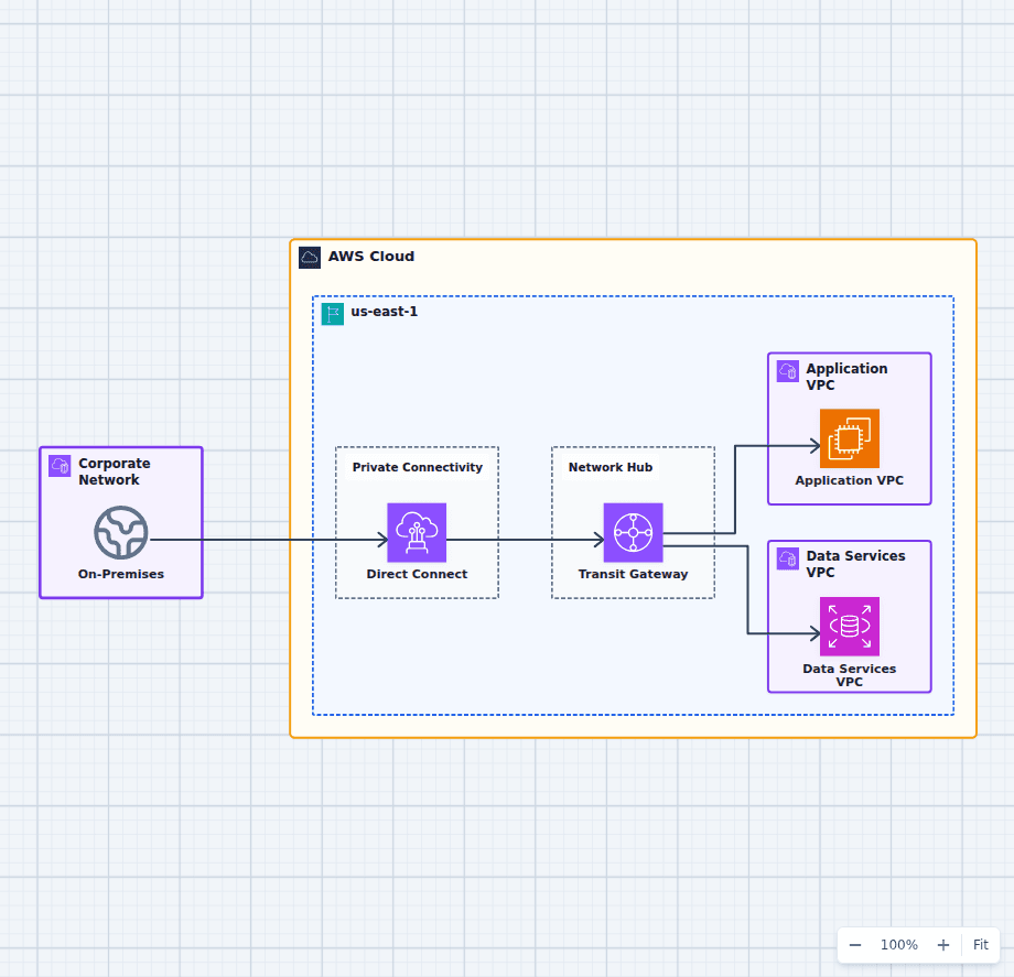
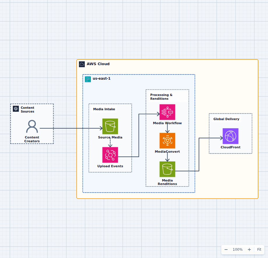
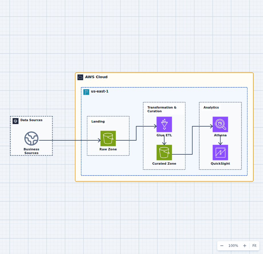
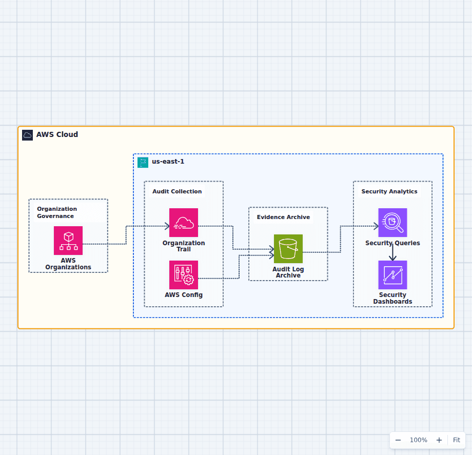
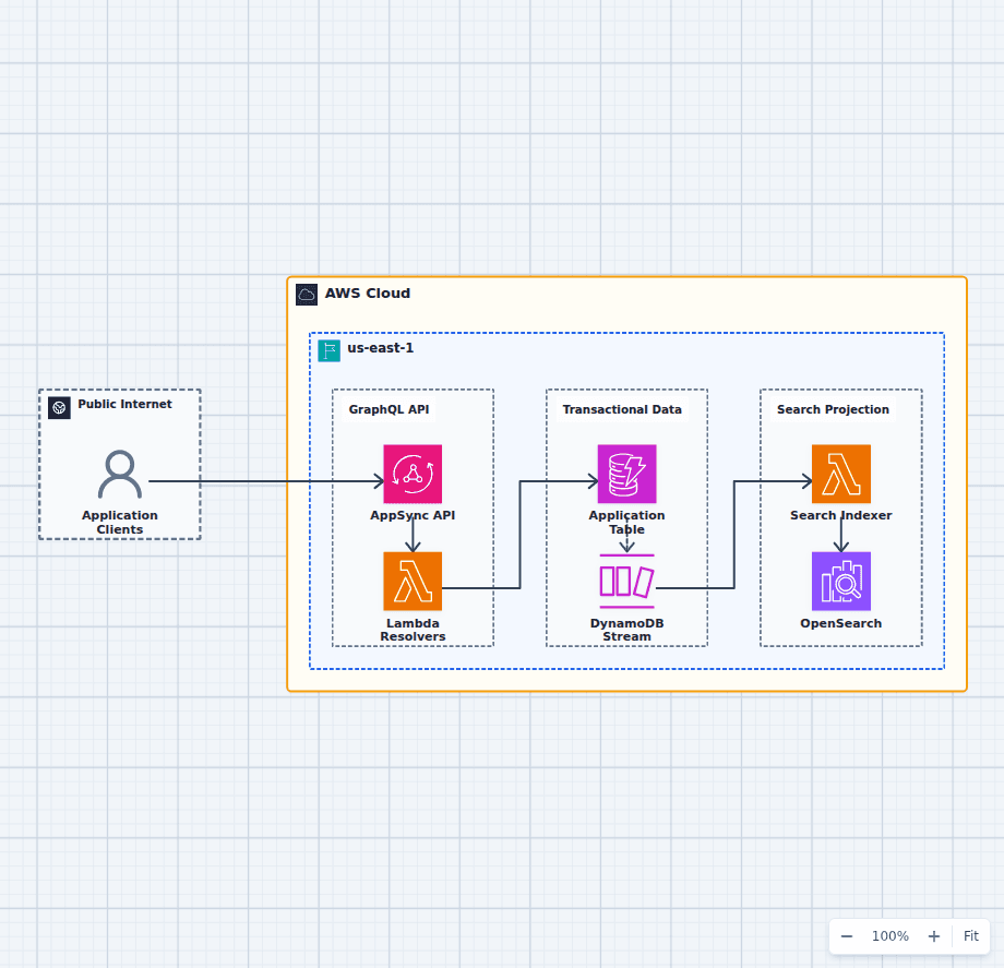
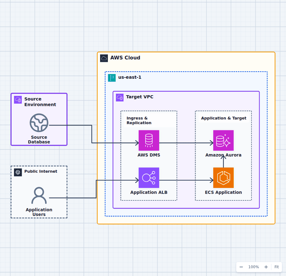
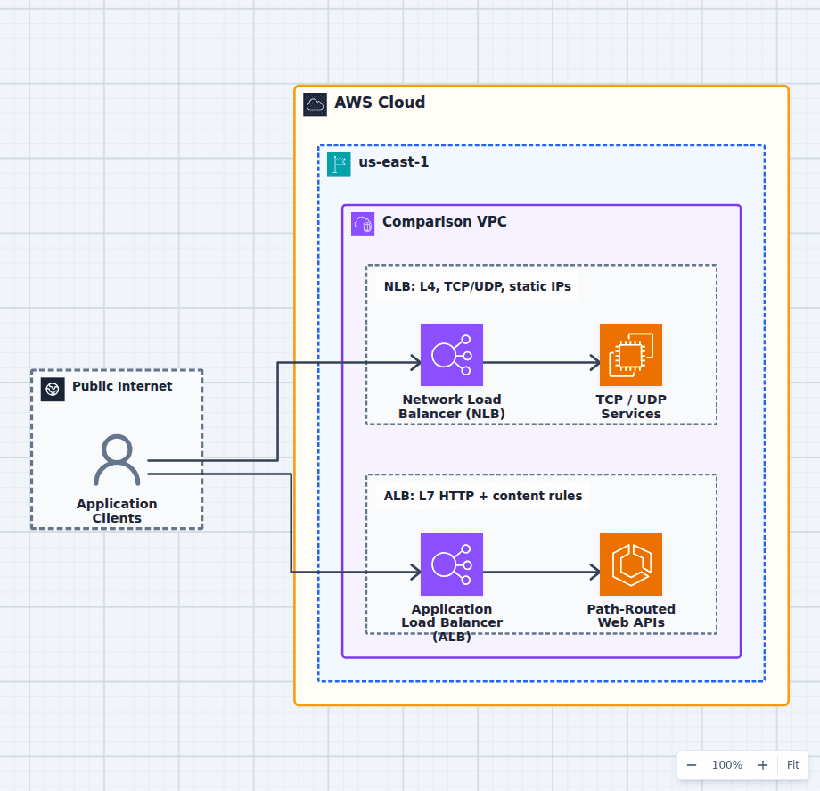
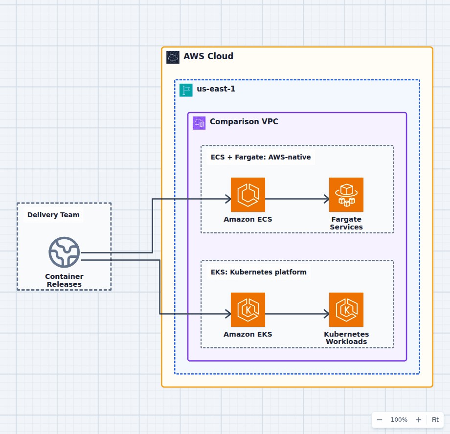
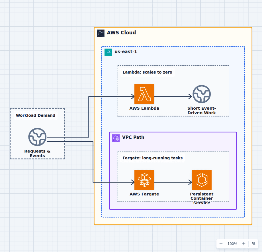
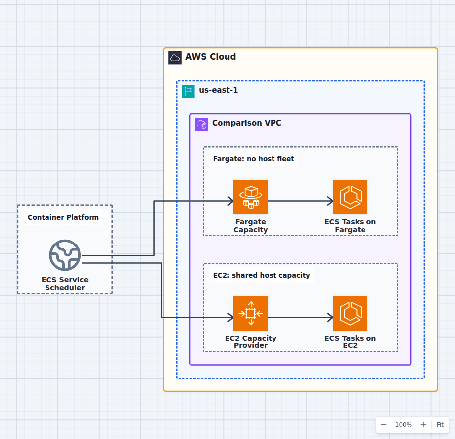
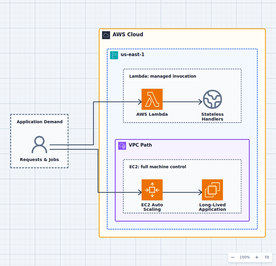
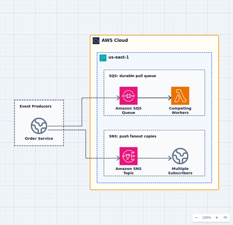
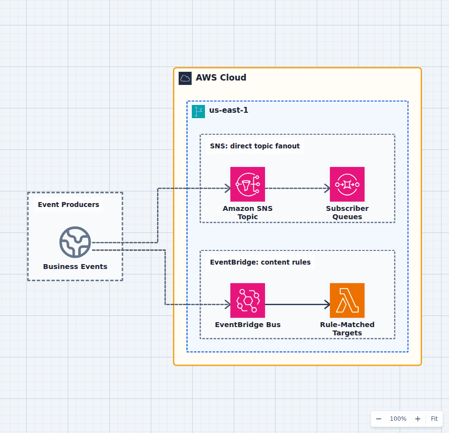
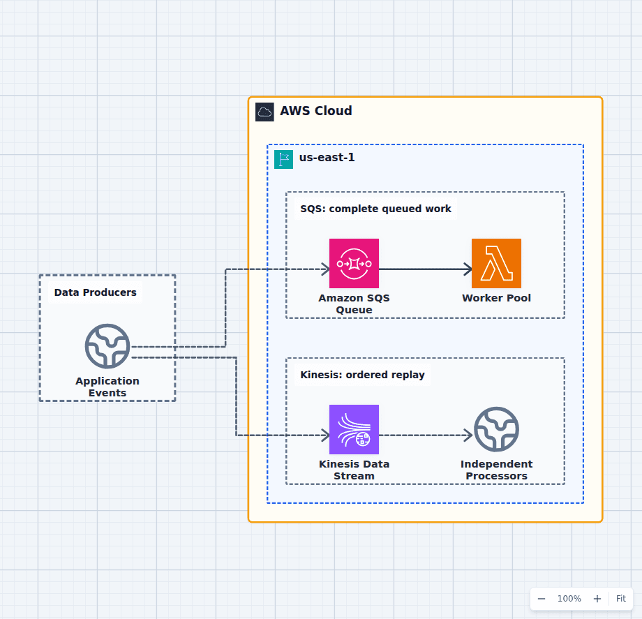
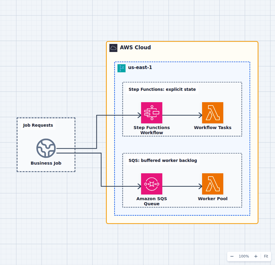
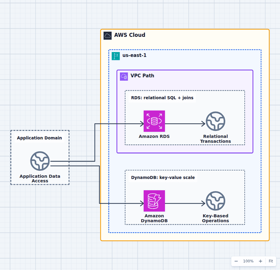
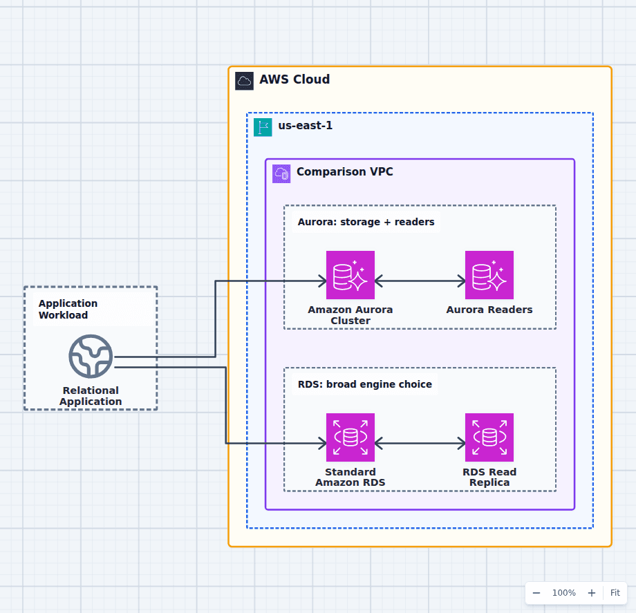
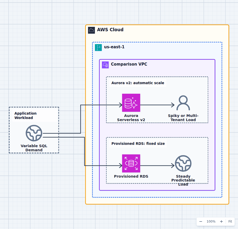
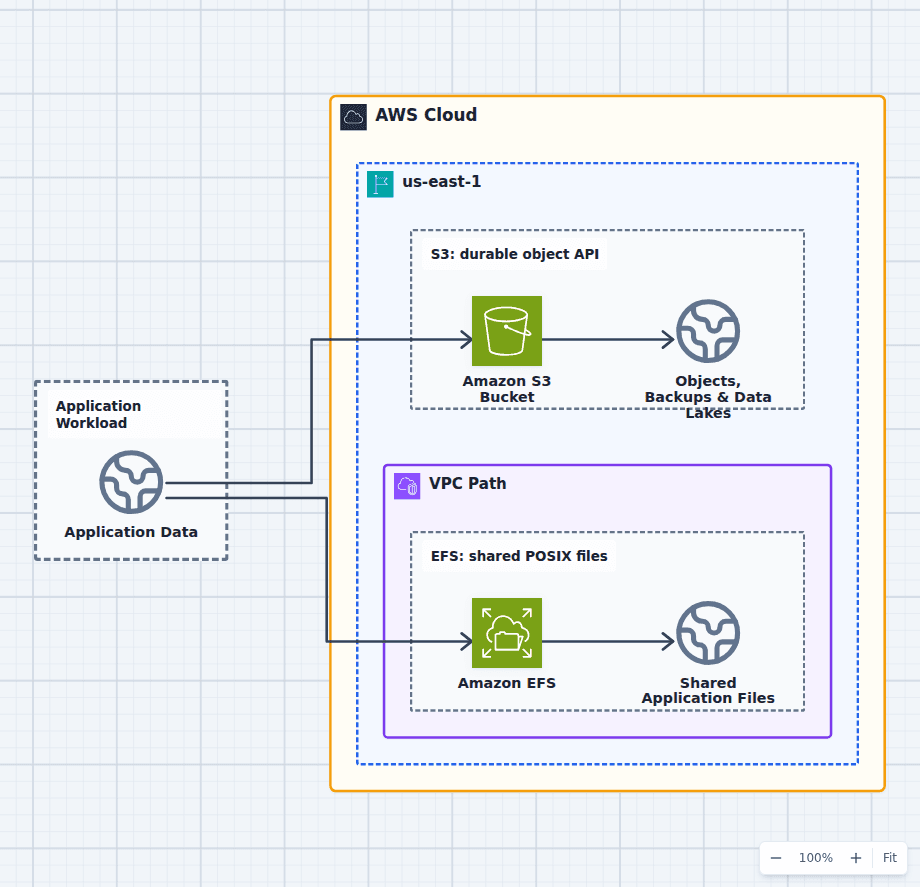
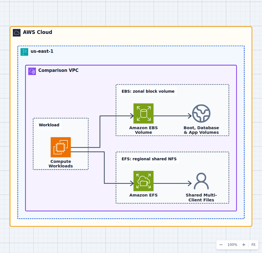
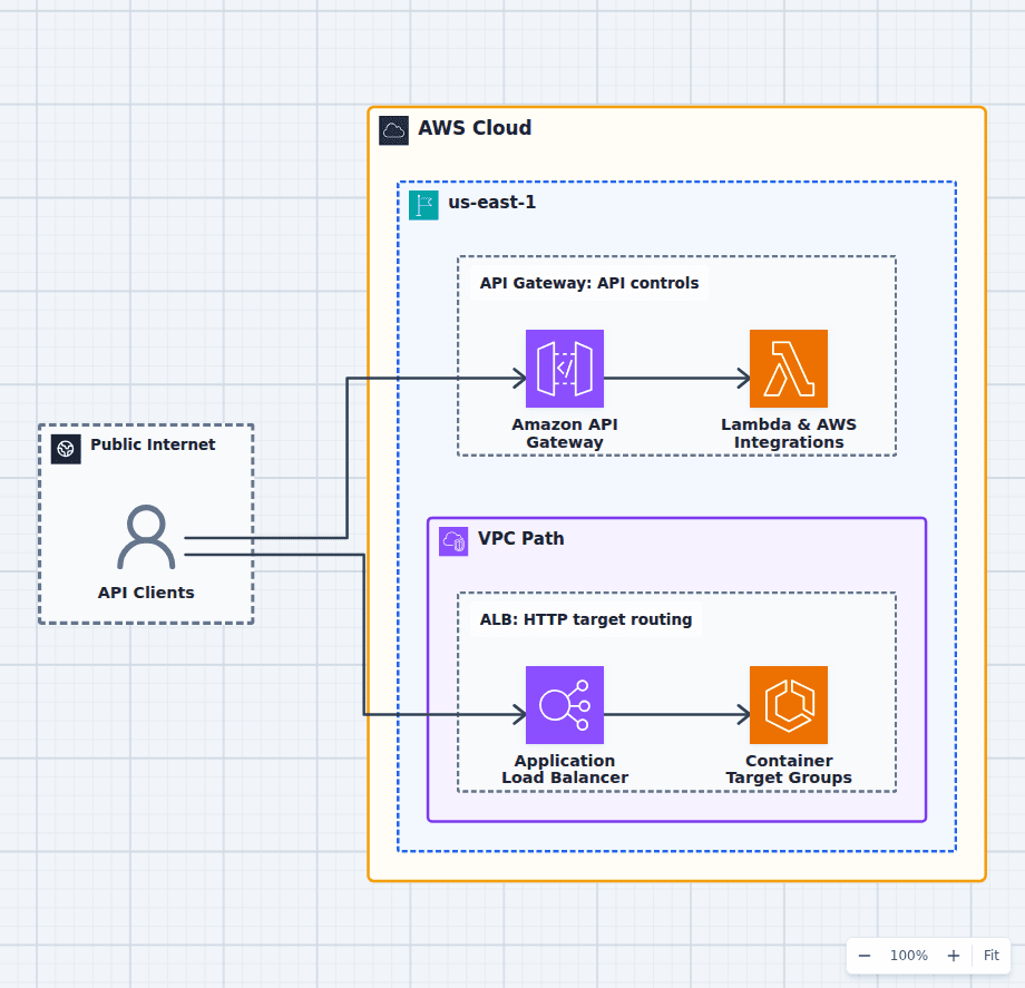
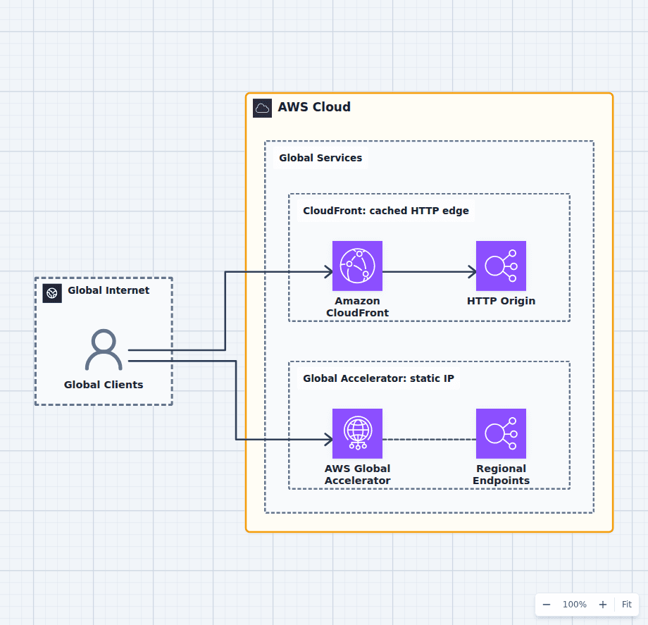
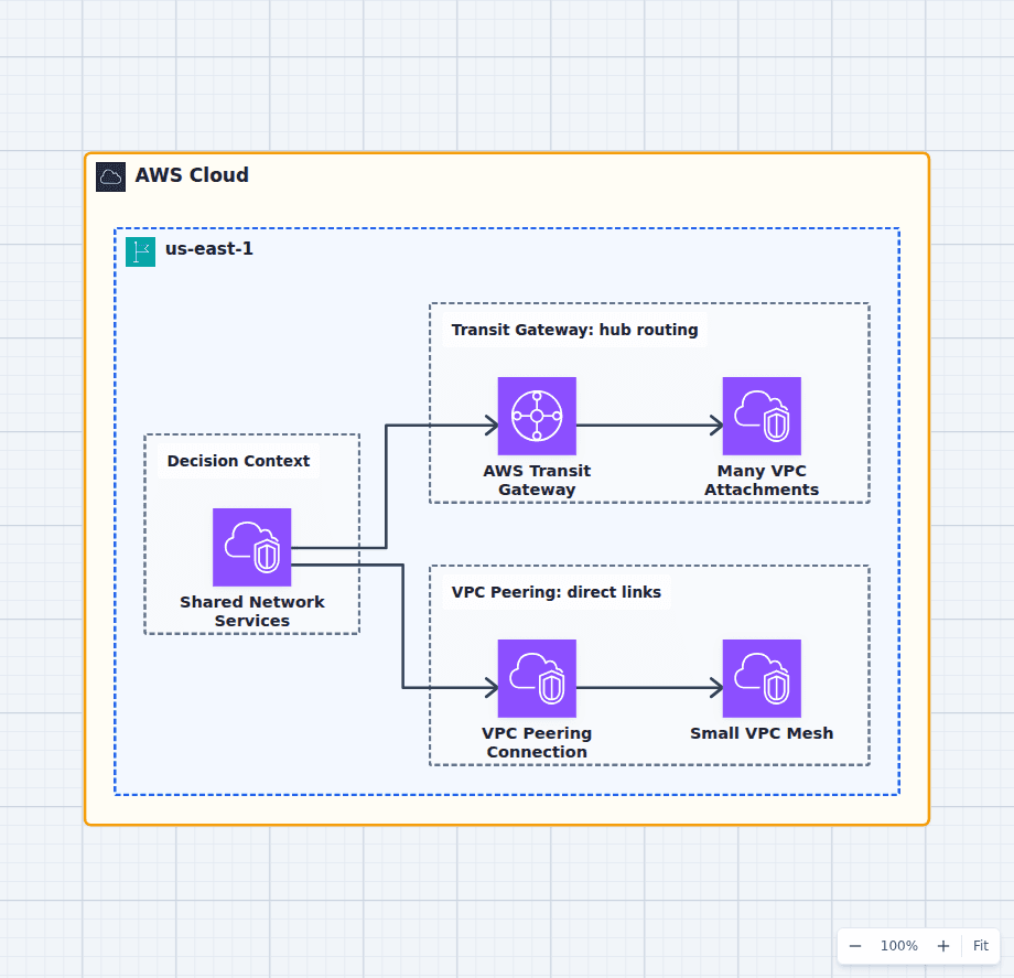
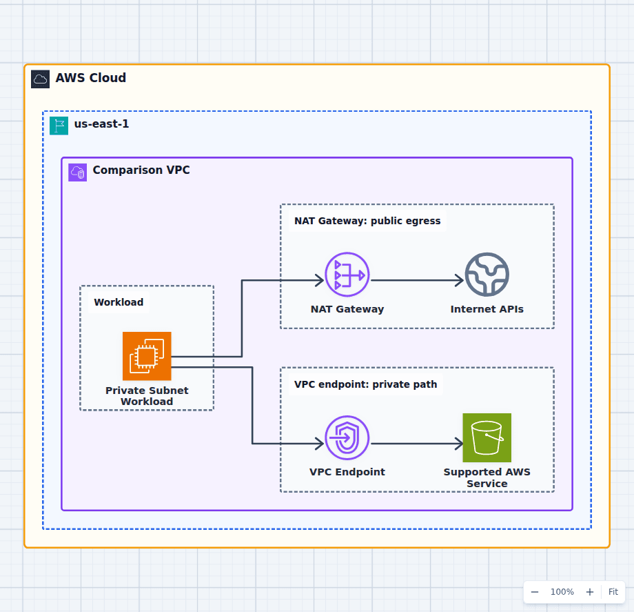
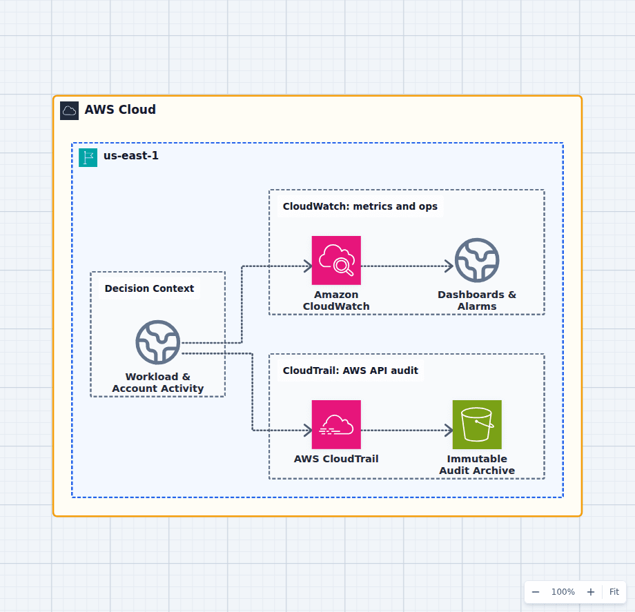
Most AWS diagrams fail in the same way: they show which services are present and stay silent on the decisions. Service icons are an inventory. An architecture is the set of choices about what is reachable, what is replicated, and what happens when one part of it fails. Every diagram in this library is drawn to make those choices visible.
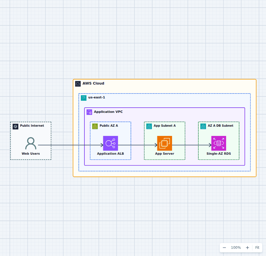
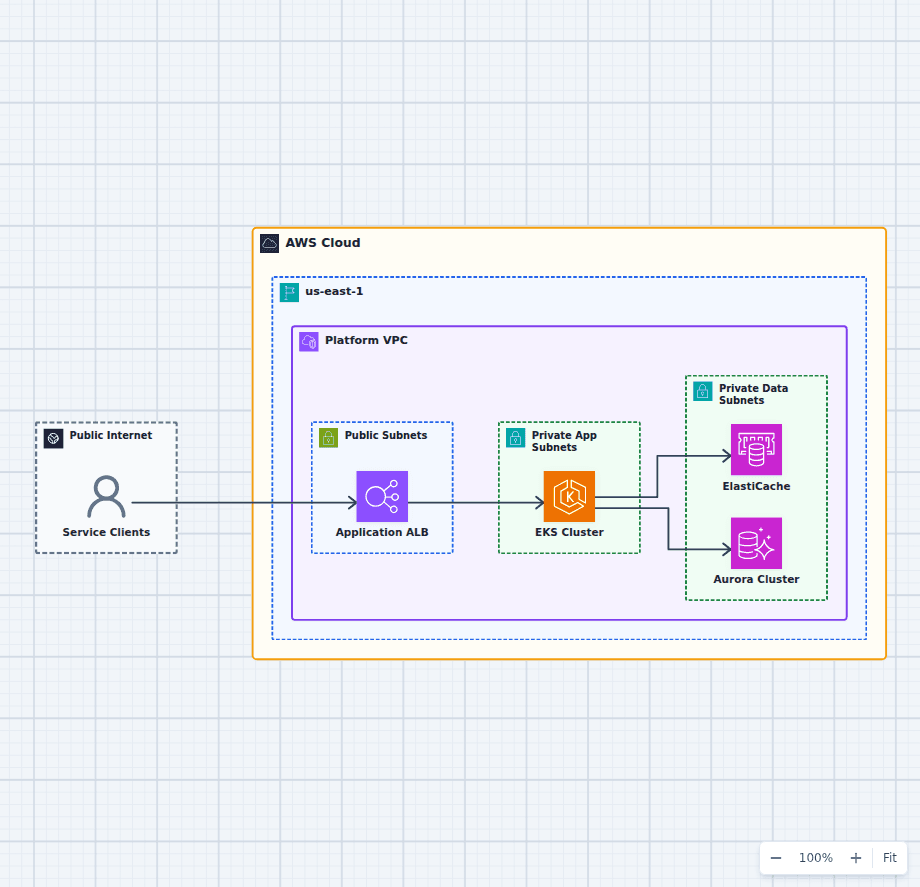
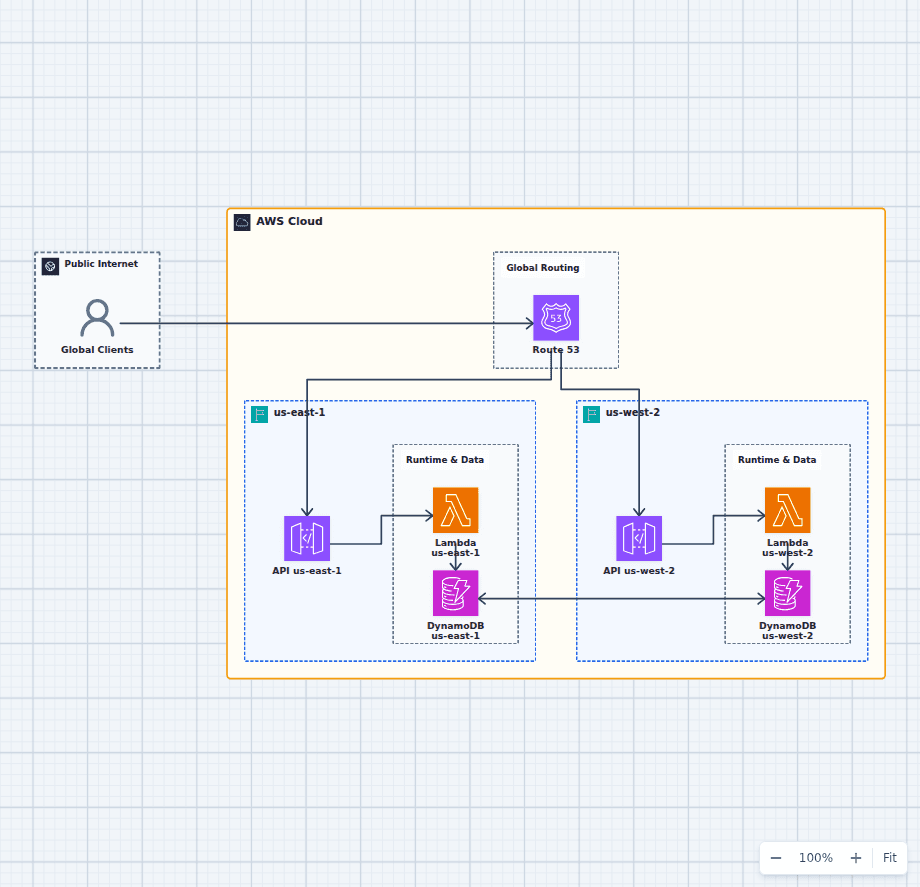
Four things carry almost all of the meaning. Boundaries come first: the AWS Cloud, the Region, the VPC, and the subnet tier a resource sits in. Nesting is not decoration, it is the statement of what can reach what. Direction comes second, because a connection drawn without an arrow hides whether a component initiates or accepts, which is the difference between a NAT gateway and an internet gateway. State comes third: where data lives, whether it is replicated across Availability Zones, and what is lost if a zone goes away. Exposure comes last and matters most, because a reader should be able to point at the public entry points and count them on one hand.
Availability Zones deserve a specific note. Redundancy is claimed far more often than it is drawn. A genuinely multi-zone design shows mirrored subnets with real occupants in each zone, not a second empty box labeled with a zone name. If a diagram claims high availability and only one zone contains anything, the claim is aspirational.
Scope each diagram to one question. A drawing that explains resilience needs zones and replication; a drawing that explains request flow does not. Attempting both on one canvas produces a picture that answers neither, which is why the library is organized by architectural question rather than by service.