Latency and throughput are usually introduced as network metrics, but they matter far more inside applications, servers, and databases, where the two pull against each other in ways a network diagram never shows.
Latency is the time a single operation takes. Throughput is the number of operations the system completes in a period. That is the whole distinction, and it is why the two can move in opposite directions: a system can answer one request in 5 ms while handling twelve users, and take 4 seconds per request at a thousand. Nothing about the code changed. Only the queue did.
Latency vs throughput at a glance
| Latency | Throughput | |
|---|---|---|
| Question it answers | How long did this take? | How much did we get done? |
| Unit | Milliseconds, seconds | Requests/sec, records/sec, MB/sec |
| Who feels it | One user, on one request | The business, in aggregate |
| Improved by | Less work per request, fewer hops, caching | More parallelism, bigger batches, more capacity |
| Made worse by | Queueing, contention, cold starts | Serialization, lock contention, small batches |
| Typical objective | p99 under 300 ms | 5,000 requests/sec at that p99 |
The last row is the important one. Neither number means anything alone. "We handle 5,000 requests per second" is not a performance claim unless it comes with the latency at which those requests were served, and "our p99 is 200 ms" is not a capacity claim unless it comes with the load it held at.
Latency, response time, and service time are not the same
These three get used interchangeably and cause real confusion in performance testing.
Service time is how long the work itself takes once it starts: the CPU cycles, the database round trip, the serialization. Wait time is how long the request sat in a queue before anything touched it. Response time, which is what the user experiences, is service time plus wait time plus network travel in both directions.
Most teams instrument service time, because that is what a handler-level timer measures, and then cannot explain why users report slowness that the dashboards do not show. The queue is invisible from inside the handler. If your p99 service time is flat while user complaints rise, you are measuring the wrong half.
Measure latency as a distribution, never as an average
An average latency is a number that describes nobody. If 95 requests take 50 ms and 5 take 4 seconds, the average is 247 ms, which is both wrong for the fast users and wrong for the slow ones.
Track percentiles: p50 for the typical experience, p95 and p99 for the tail, and the maximum for the worst case. The tail matters more than it looks, because a single page often makes many calls. A page issuing 20 backend requests expects about one of them to exceed the p95, and has better than a 60 percent chance of at least one exceeding it, assuming the calls are independent. So a p95 of 2 seconds is not an edge case for that page. It is the normal experience.
Two rules that save a lot of argument later:
- Percentiles do not average. You cannot take the p99 from ten servers and average them into a fleet p99. Aggregate the underlying distribution, or use a data structure built for it.
- Say where the clock starts. Latency measured at the load balancer, at the application, and at the client are three different numbers. Only the client's includes DNS, connection setup, TLS negotiation, and the return trip.
Throughput needs a unit that maps to completed work
Throughput gets expressed as requests per second, transactions per second, records per second, or bytes per second. Which unit you pick decides whether the number is honest.
A service that accepts 10,000 requests per second and queues 9,000 of them has high ingress, not high throughput. A batch job that reads a million rows and writes a hundred has a throughput of a hundred useful records per second, whatever the read counter says. Count things that finished and were correct, and count them after the retry logic, not before. Retries inflate throughput while making the user experience worse.
The curve: why latency stays flat and then explodes
Plot latency on the vertical axis and throughput on the horizontal one, and the shape is always the same. Latency is nearly flat across the low and middle range, bends upward as utilization gets high, and then goes vertical. That bend is the knee, and for many single-resource services it lands somewhere in the region of 70 to 80 percent, though the exact point depends on how many servers share the work and how variable the arrivals and service times are.
The mathematics behind it is queueing theory, and the intuition is simple: as a resource approaches full utilization, an arriving request is more and more likely to find it busy and have to wait. In the standard single-server model with random arrivals, waiting time grows in proportion to 1/(1-utilization), so going from 80 to 90 percent utilization does not add 10 percent to your wait, it roughly doubles it, and 90 to 95 doubles it again. Real systems depart from that model in both directions: more servers, more predictable arrivals, or less variable service times push the knee higher, while bursty arrivals or a long tail of slow requests pull it lower. Treat the shape as reliable and the exact position as something to measure.
Two practical consequences:
- Do not run at the knee. The capacity between the knee and full utilization is real but unusable, because latency there is unstable and a small traffic increase produces a large latency increase. Find your own knee by load testing, then size for it rather than for the ceiling.
- A latency graph without a load axis is not evidence. "Latency improved after the deploy" means nothing if traffic also dropped. Always read the two together.
Little's Law ties the three quantities: concurrency = throughput x latency. If 500 requests per second each take 200 ms, there are 100 requests in flight at any moment. This is the fastest sanity check in performance work. If you measure concurrency and throughput, latency is determined; if a vendor quotes you two of the three and the third does not follow, one of the numbers is wrong.
Where the time actually goes
Common latency sources, roughly in the order they surprise people:
- Queueing before the handler. Connection pool exhaustion, a saturated thread pool, or an accept backlog. Invisible to handler-level timers.
- Blocking I/O and dependency calls. One synchronous call to a slow third party sets a floor on your latency that no amount of scaling removes.
- Database work. Table scans, missing indexes, lock contention, and connection exhaustion. Databases are the most common single-point bottleneck because they are the hardest tier to scale horizontally.
- Serialization and large payloads. JSON encoding of a large response can rival the database call that produced it.
- Garbage collection and memory pressure. Produces the characteristic pattern of a flat p50 with a spiky p99.
- Cold starts. In serverless, the tail is partly initialization. Provisioned concurrency trades cost for a shorter tail.
- Chatty cross-zone or cross-Region calls. A cross-Region round trip is tens of milliseconds of pure physics. Ten of them in sequence is half a second you cannot optimize away.
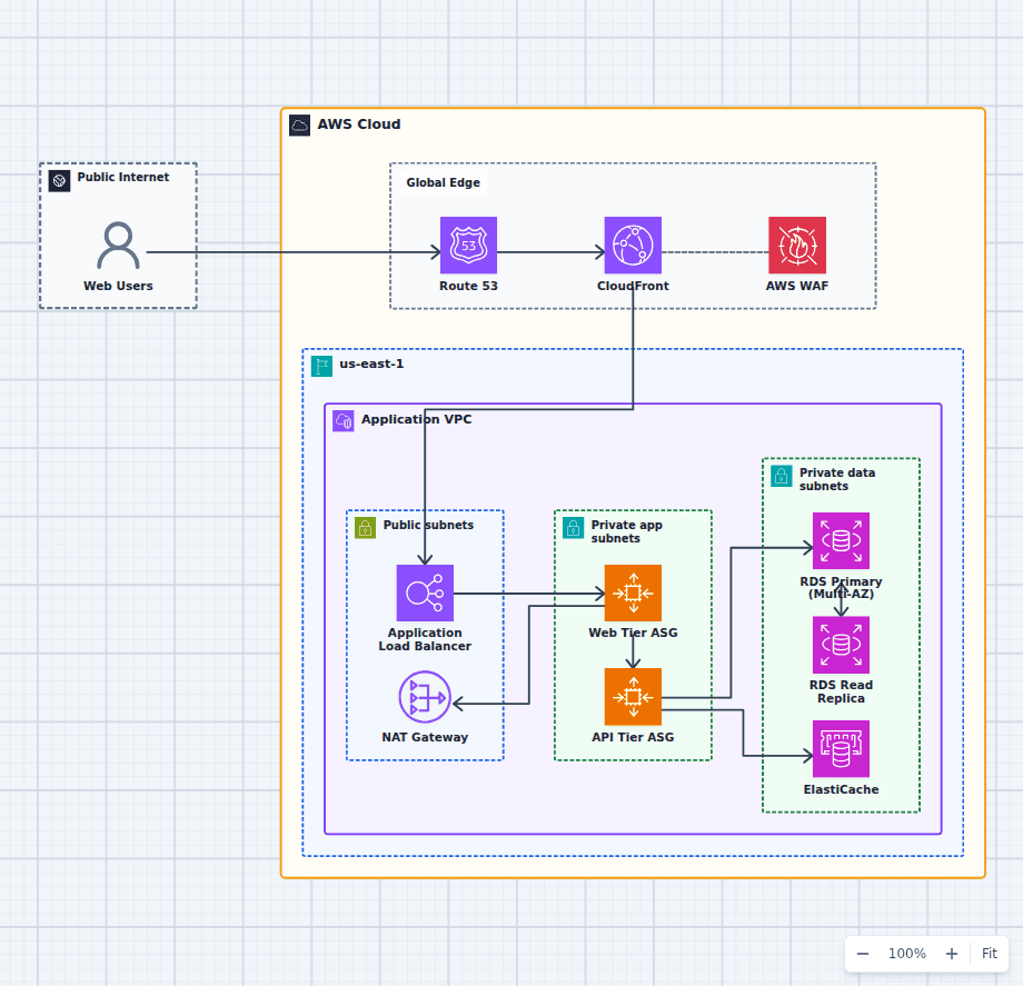
- Inline security inspection. A web application firewall, TLS termination, or a proxy each add a small fixed cost per request. Individually negligible, and worth measuring rather than assuming when several stack up in one request path.
Caching changes the distribution, not just the mean
Caching is the most common latency intervention and the most commonly mismeasured. A cache does not make requests faster; it makes some requests faster and leaves the rest alone. A 90 percent hit rate turns a uniform 200 ms into a bimodal distribution: 90 percent at 2 ms and 10 percent still at 200 ms. The average looks transformed. The p99 does not move at all, because the p99 is drawn entirely from misses.
This is why cache work should be judged on the hit-rate curve and the p99 separately. It is also why cache stampedes are so damaging: when a popular key expires and a thousand requests miss simultaneously, the origin sees a load spike it was never sized for, and every one of those requests waits behind it.
Tuning: scale the actual bottleneck
The single most common performance mistake is adding capacity to a tier that was not the constraint. More application instances do not fix a serialized database lock, they add contention for it. A faster database does not fix a synchronous call to a slow third-party API. A CDN does not fix a slow personalized endpoint.
A workload model is what keeps this honest. Before testing, know the arrival rate and its shape, the concurrency, the request mix, the payload size distribution, the cache hit rate, and how dependencies behave under load. Load testing a single perfect request at a fixed rate will validate the path real users never take.
Then change one constraint at a time, run a representative test, and compare percentiles and throughput together. An optimization that improves p50 while reducing capacity is usually a bad trade, and you cannot see it if you only watch one axis.
Bound your concurrency and apply backpressure rather than accepting unbounded work. An overloaded system that rejects excess requests quickly recovers; one that queues them without limit converts a load spike into a total outage, because every request eventually times out and gets retried, doubling the load that caused the problem. The event-driven order architecture shows a durable buffer placed between producers and consumers that run at different rates.
Choosing which one to optimize
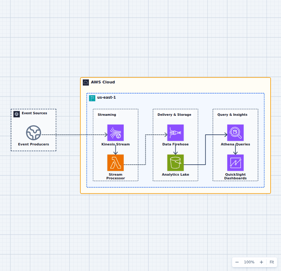
Interactive request paths are latency-first: users perceive delay directly, and capacity is usually easy to add. Batch and analytical paths are throughput-first: nobody watches an individual record, and total time to complete the set is what matters. Streaming systems need both, expressed as end-to-end event age rather than per-stage latency, because a pipeline where every stage is fast can still deliver stale data if any stage is backed up.
Optimizing hard for latency can dedicate more resources per request and reduce total capacity. Optimizing hard for throughput builds queues that violate interactive targets. Define both objectives, state the load each is measured at, and test them together.
The production high-availability web platform is a useful map for deciding where latency accumulates across tiers, and the real-time analytics architecture shows where backpressure and freshness belong. For a related distinction that trips up CDN and upload work specifically, see first byte versus last byte latency.
Good performance work is empirical: change one constraint, run a representative test, compare percentiles and throughput, and confirm the improvement actually reaches a user.